


DIGITAL MARKETING
FLYERS


DESIGN
GRAPHIC & MARKETING
Graphic design plays a crucial role in how we communicate, understand, and engage with the world around us. It’s more than just making things look good—it’s about solving problems visually and delivering messages in a clear, effective, and compelling way. Whether it’s a logo, website, advertisement, or product packaging, strong graphic design helps build brand recognition, establish trust, and influence decision-making.
BRAND CONCEPT
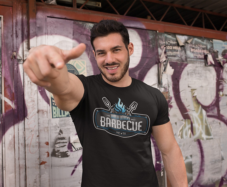
Holy Union Barbecue is where divine flavor meets down-home tradition. Born from the soulful barbecue traditions of North Carolina and Texas, Holy Union brings together the best of both regions in one mouthwatering experience. Our signature style blends slow-smoked meats, bold rubs, and house-made sauces with a touch of sacred fire, represented by our iconic flame and twin forks. Whether you’re dining in, grabbing takeout, or catering a celebration, Holy Union BBQ delivers an experience so good, it feels like a religious experience.
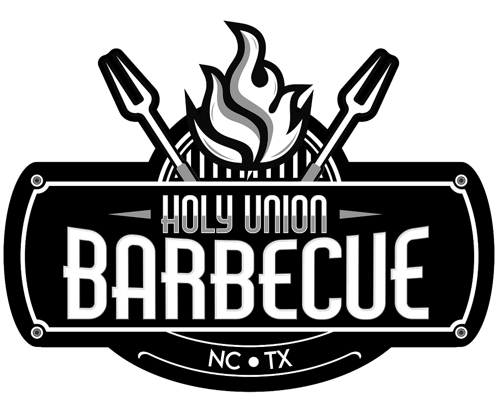
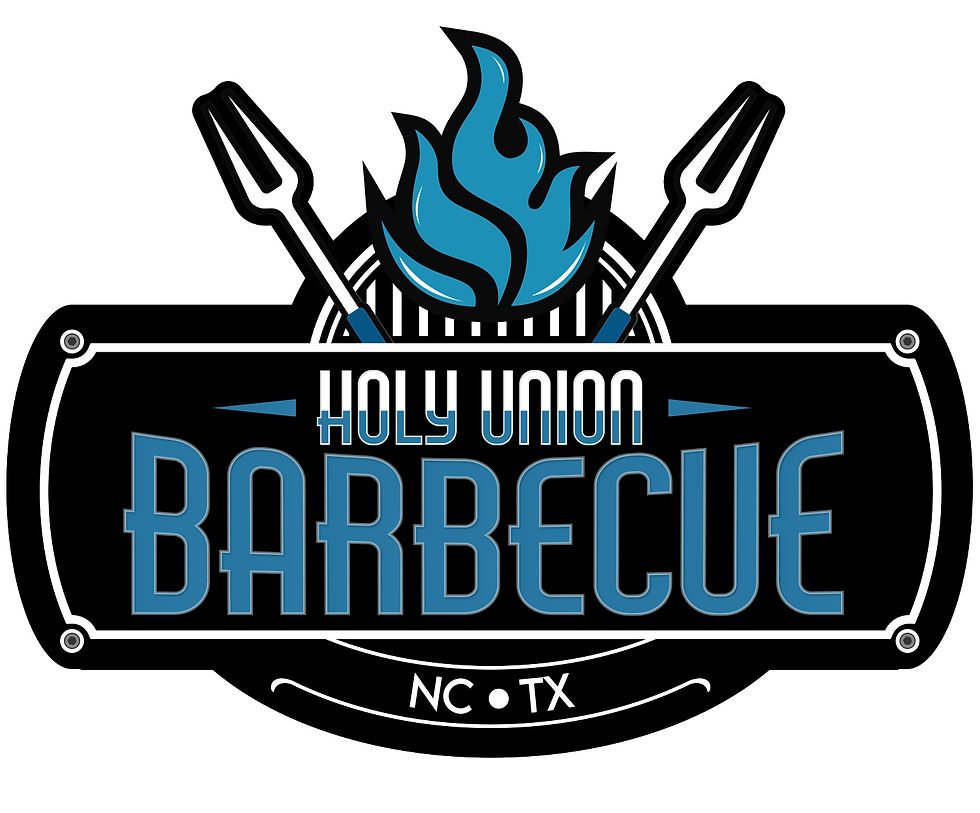
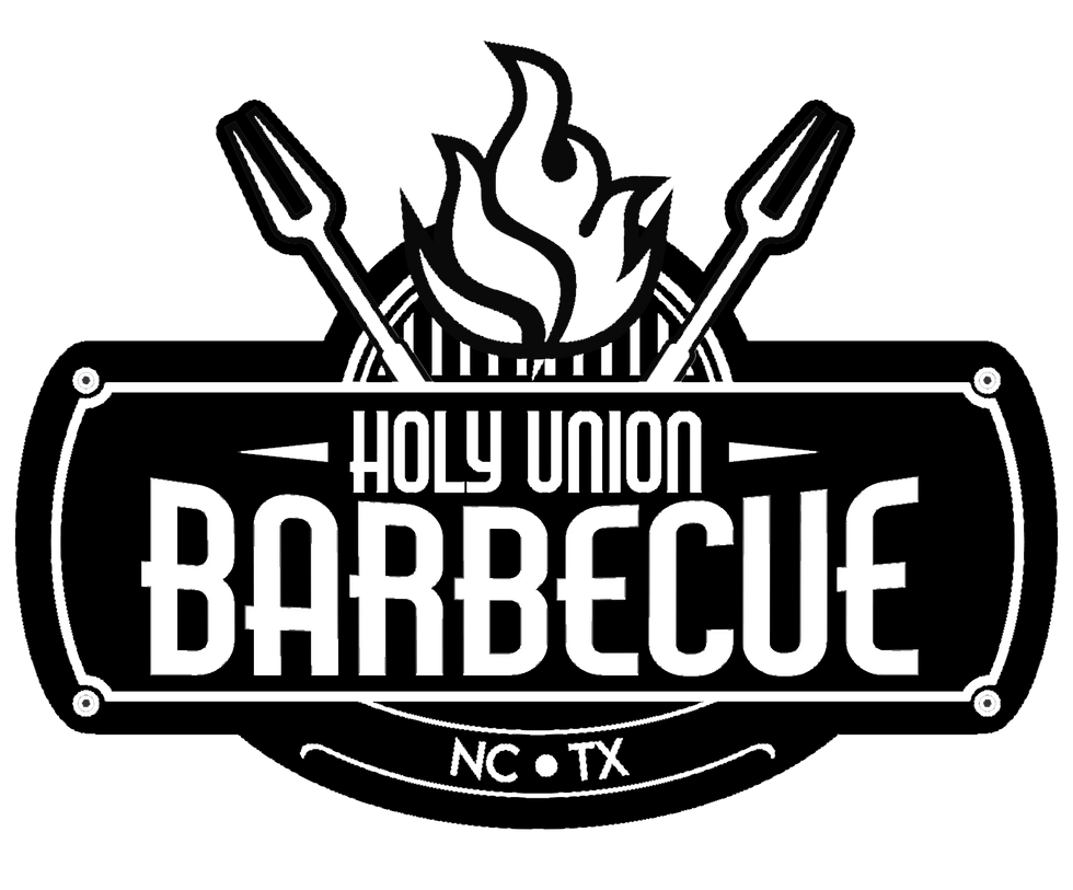
VARIATIONS
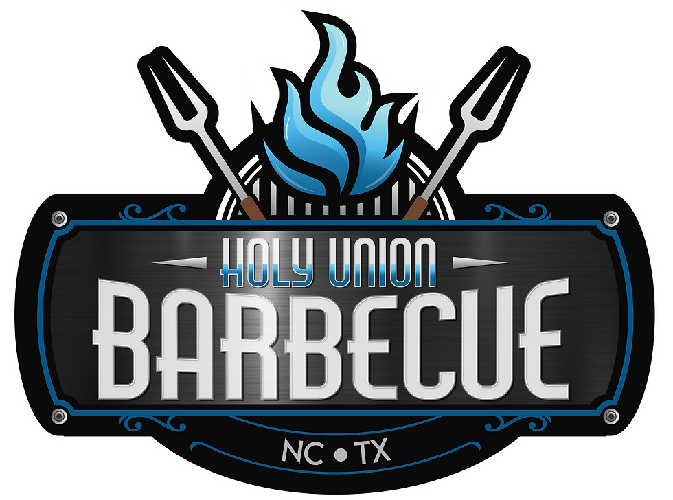
SACRED FLAME
The flame at the center symbolizes the “divine” aspect of Holy Union, alluding to the sacred fire of barbecue and the soulful heat behind slow-smoked meats. The gradient blues give it a unique, celestial twist—setting it apart from traditional red flames and tying it to a more “holy” visual language.
TWIN FORKS
Crossed behind the flame are two barbecue forks, representing the "union" of North Carolina and Texas—two iconic barbecue traditions. Their inclusion reinforces both the cultural and culinary fusion at the center of the brand.
COLOR PALLET
Blues and dark greys balance the fiery theme with a cool, modern vibe. This makes the brand feel elevated and fresh while still grounded in smoky, classic barbecue roots. Together, the color scheme suggests intensity, quality, and modernity, while also maintaining a welcoming and trustworthy tone.
OVERALL SHAPE
The shield-like badge frame gives the logo a solid, dependable shape—ideal for signage, apparel, menus, and packaging. The framing details add character and visual richness, nodding to Southern craftsmanship and vintage BBQ signage without feeling dated.
BRAND CONCEPT
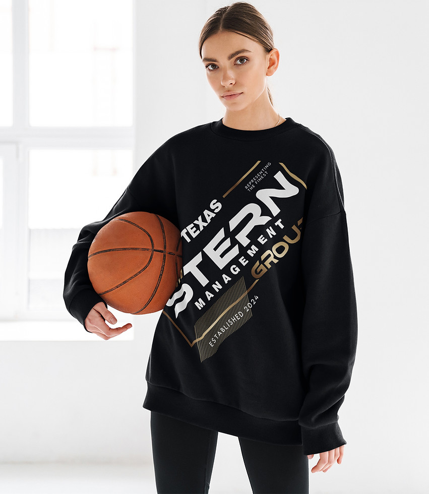
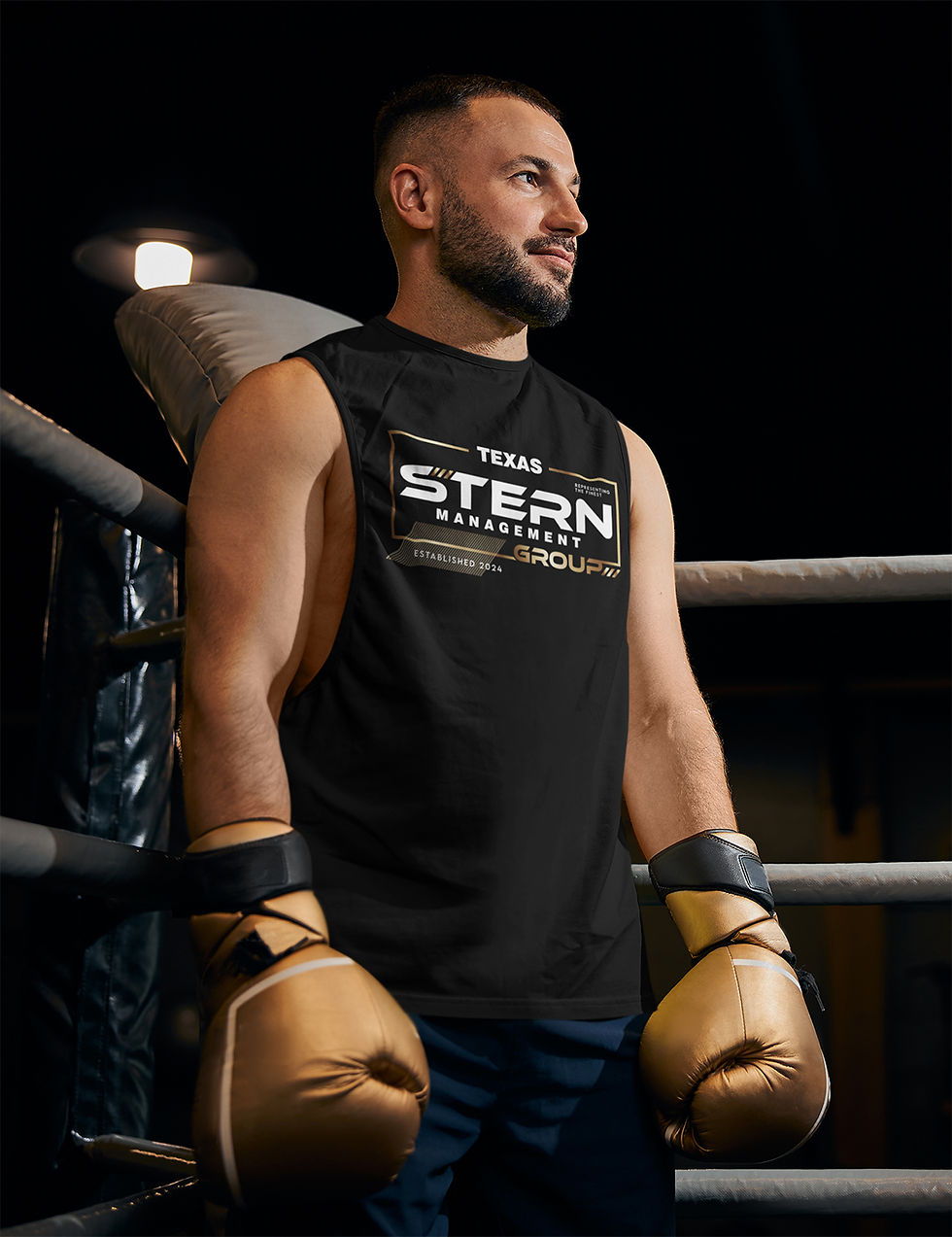
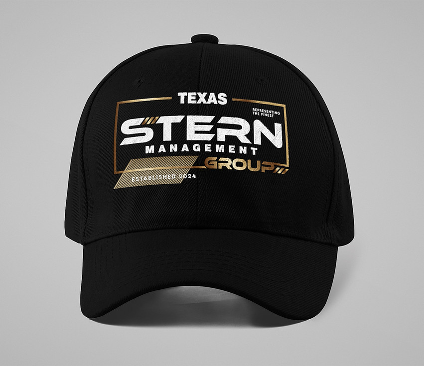
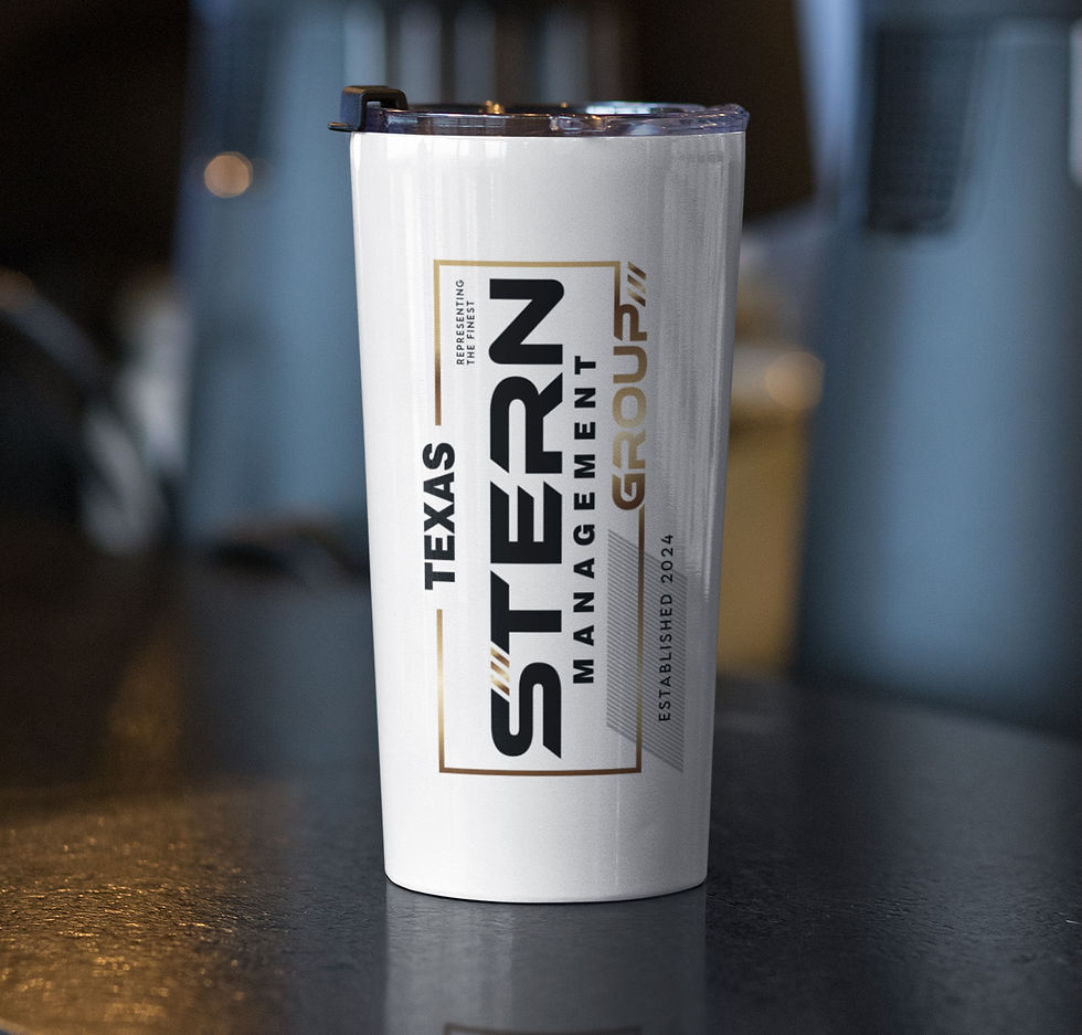
Stern Boxing Enterprises, a proud family business rooted in Texas boxing scene, came to me ready to evolve. With a new name—Stern Management Group—they aimed to expand beyond boxing into fitness and performance management. The redesigned logo reflects this bold shift. Clean lines, sharp typography, and a refined gold-and-white palette elevate the brand’s image, positioning it for growth while staying true to its athletic roots. It’s a modern identity for a brand committed to “Representing the Finest.”
new logo
old logo

Older logos often become outdated due to shifts in design trends, consumer expectations, or the need for improved clarity and impact. A fresh redesign can enhance brand identity, making it more memorable and engaging. The new Stern Management Group logo is a bold evolution from the original. Sleek, modern, and professionally composed, it reflects a more sophisticated brand identity while retaining the strength and energy of the original concept. It’s not just a logo upgrade—it’s a brand transformation.
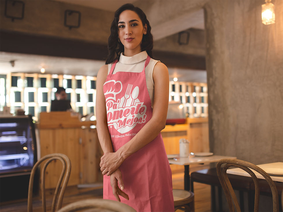
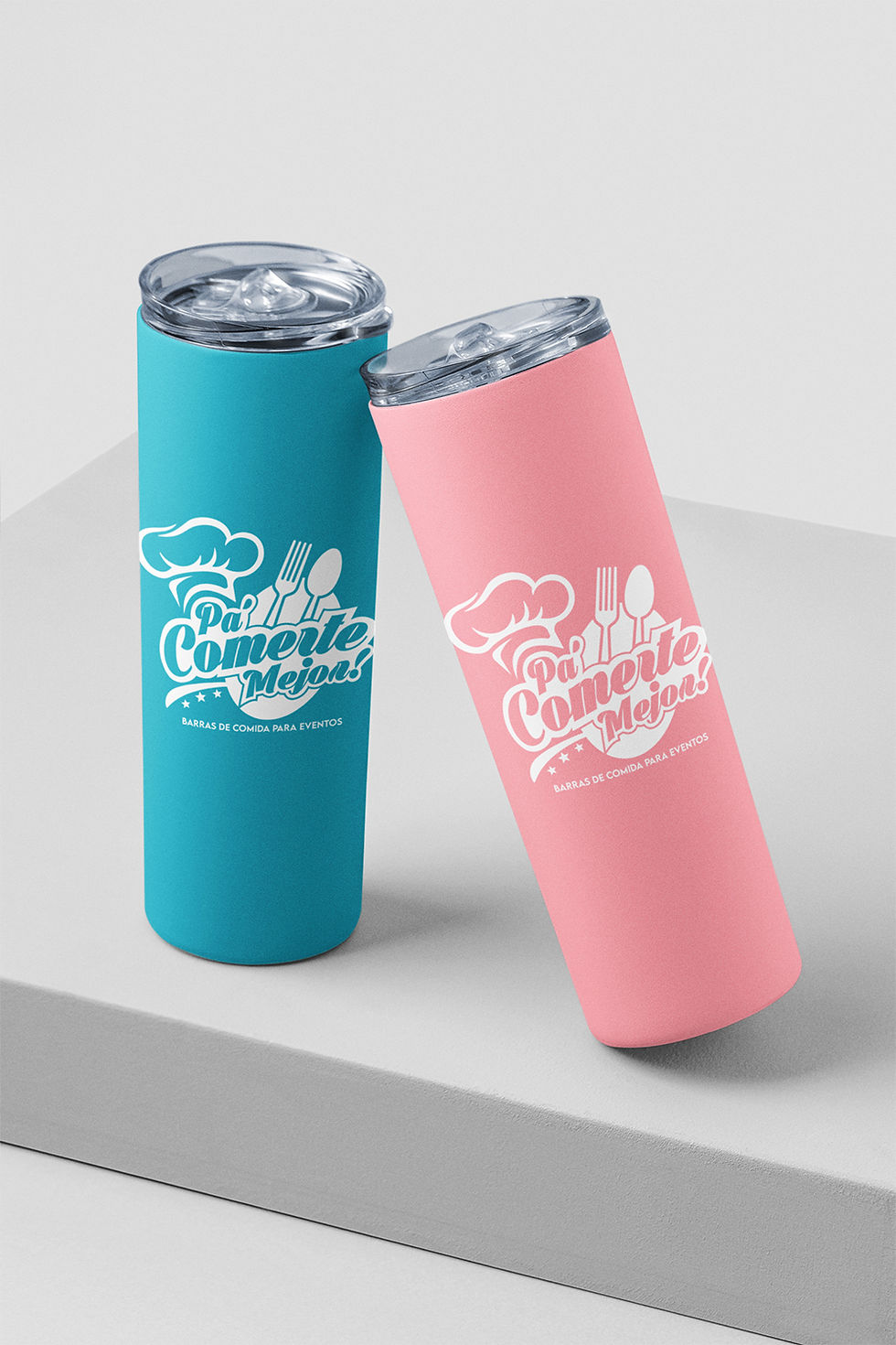
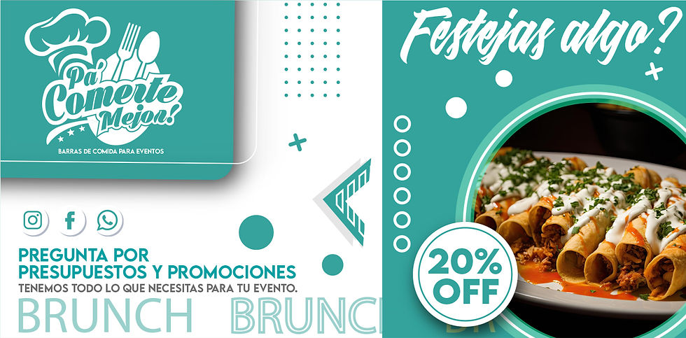
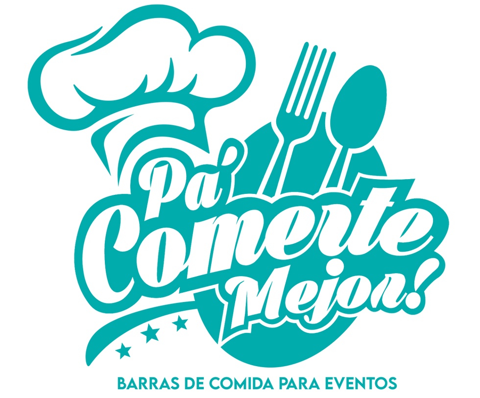
BRAND CONCEPT
Pa Comerte Mejor is a catering brand dedicated to transforming events into unforgettable culinary experiences. The name itself—meaning "to eat you better" in Spanish—captures the essence of indulgence, quality, and a passion for food that elevates any occasion. From intimate gatherings to grand celebrations, the brand specializes in food bars that bring a dynamic and flavorful touch to events, ensuring that every guest enjoys a carefully crafted selection of delicious offerings.
FLYERS | DIGITAL MARKETING | PRESENTATION CARDS
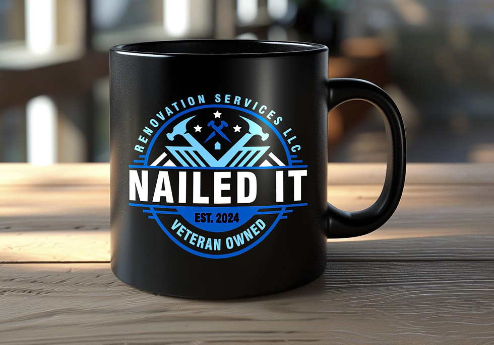
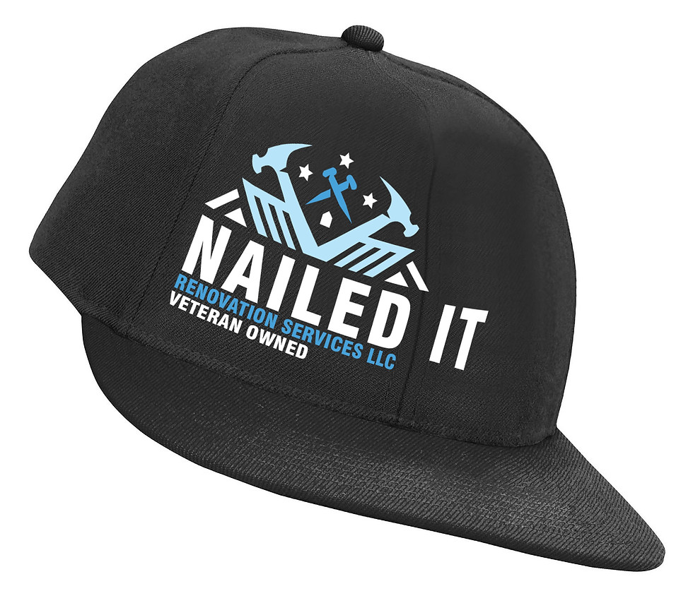
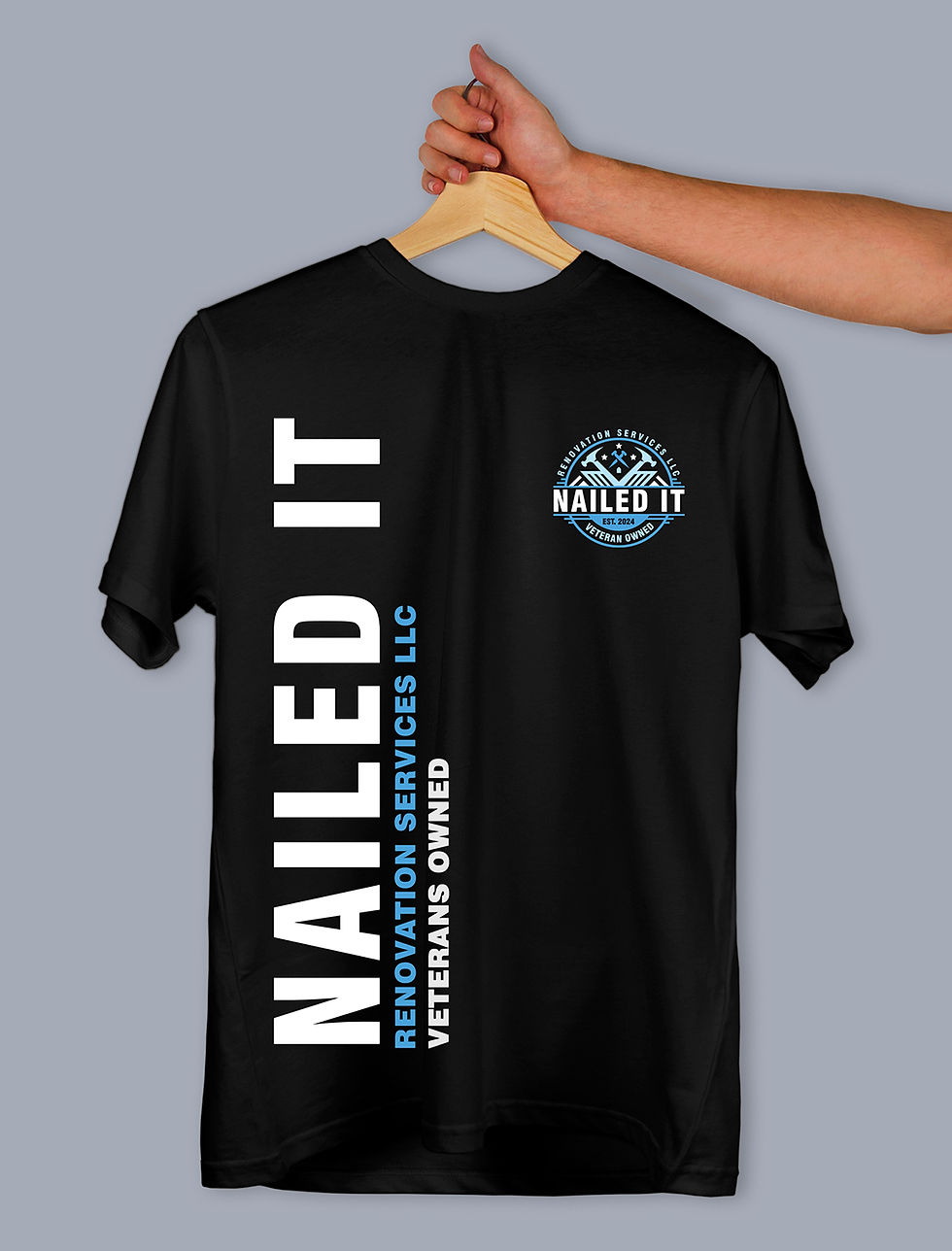
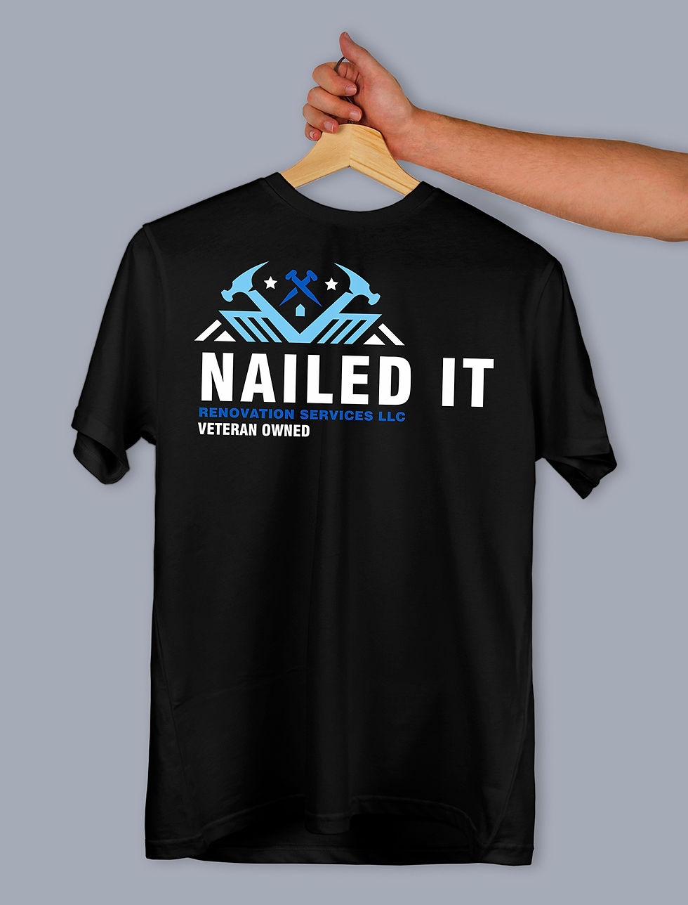
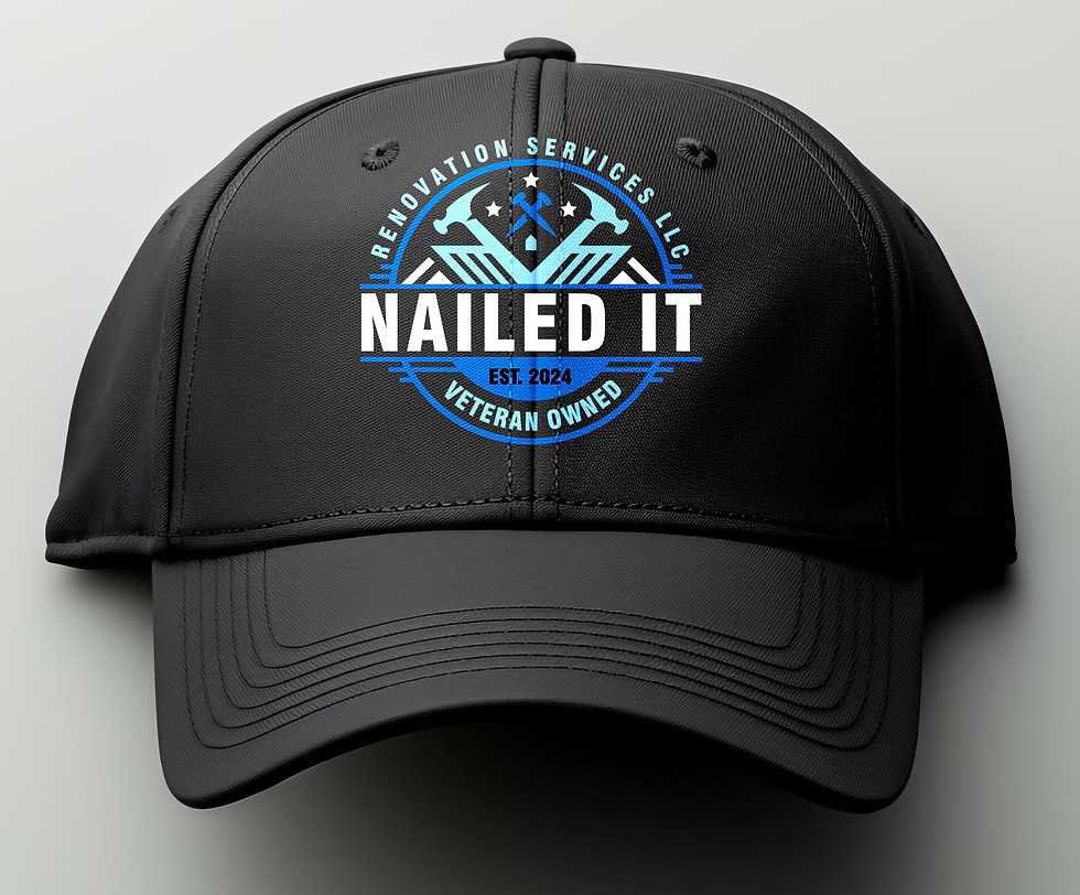
BRAND CONCEPT
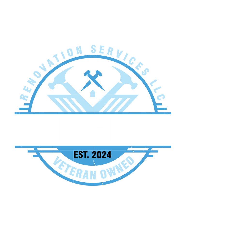
As a veteran-owned business, Nailed It brings a unique blend of precision and passion to every project. The mission is simple: to transform houses into homes that exceed expectations. From meticulous renovations to personalized details, the team is committed to delivering quality workmanship that stands the test of time. Nailed It doesn’t just renovate spaces; it creates living experiences tailored to each client’s vision. Let the experts at Nailed It bring any dream home to life—one nail at a time.


VARIATIONS
Blue is often associated with qualities such as trust, dependability, and calmness. When people see a blue logo, they tend to perceive the brand as trustworthy, professional, and reliable. Additionally, the versatility of blue allows it to convey a wide range of emotions and messages depending on the shade used. Darker blues, such as navy, can evoke feelings of authority and strength, making them suitable for corporate brands. Lighter blues, like sky or baby blue, can evoke a sense of openness and approachability, making them ideal for brands aiming to connect with consumers on a more personal level.
BRAND CONCEPT
Customizable snack and candy bar experience designed to elevate any celebration — from weddings and birthdays to corporate events and private parties. More than just a table of treats, it’s a centerpiece of joy and indulgence that combines visual appeal with irresistible flavors. Each setup is tailored to match the event’s theme, using curated décor, coordinated packaging, and a balanced mix of sweet, salty, and savory snacks. Guests are invited to explore, taste, and even take home little bites of happiness, turning every celebration into a memorable sensory experience.


logo after

logo before
The redesigned logo is a better option because it captures the fun, playful spirit of a candy brand with bold colors, dynamic typography, and multiple candy illustrations that instantly communicate variety and indulgence. Unlike the old version, which feels a little flat and generic, this design is vibrant, memorable, and versatile; perfect for packaging, signage, and marketing materials that need to grab attention and create excitement.